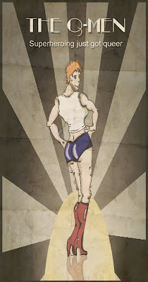
It's over. At least I hope it is. Everything is handed in, it's just a matter of plating the waiting game, "Aw the waiting game sux let's play Hungry Hungy Hippos*!"
There are rumours floating around that there needs to be a review of the entire production, other rumours are that there be atleast 14 blog posts. I can't be bothered counting to see if I made it, there's a few, several in fact. More than a few. But I'm adding this last one to hopefully put me over the top.
My final impreseeions of my piece are "Meh". It certainly won't be winning me any awards or jobs. It's short. It has minimal animation. It's I dunno, "meh". Maybe in a few weeks I'll like it again. But on the positive, it looks like what I wanted it to, there just isn't enough of it.
My biggest gripe is that I spent so much time bemoaning my inability to draw, I didn't get enough done. As a result all I have are sliding images accross the screen. Given last year I had some hand drawn pose to pose animation, it does feel a little like a regression.
However given my realistic goals were at the start of the year was to have a grasp of Photoshop, After Effects and also to ensure that the images were high resolution and wide screen (last year this was not the case). So in that regard the year was a success. I have my head around import and export qualities and file types, and I have a base knowledge of Photshop, After Effects and Premiere. Mission accomplished.
The other goal was to have a piece that I could continue to work on and shop it around to sell it as a series. I have to admit, I feel silly even saying that. As if it is even a viable goal. But that is what I came to the course for. And while the final piece is far from jaw dropping, it does capture some of the quirk and interest I was hoping for. Also the majority of people to see the final version or close to the final version, have all without prompt stated it makes them want to watch a complete episode, and these are people who have seen much of the work before. It is really nice to get that response, and it does make me think that I haave achieved what I set out to.
So basically, I guess what I am left with is close to what I aimed for; that is a piece that represents what I had in my head, and a greater technical knowledge. It is by no means a great achievement in either technique, skill or story, but it gets the job done. I will be continuing with it, completing the 3-4 micro episodes covering off some of the major characters within the universe, and then I will be taking it round (whatever that means) to try and sell it at a series. Ultimately that is what I think I have elarned from the piece. I am not an animator. I don't want to be either. But I do want to have the skills to work in the industry, and making stuff happen is where I really want to be; writing, directing and/or show running. I have neither the patience or the skill to whip up great artwork, leave that to the Yen's of the world, they do much better job than I ever could. I'll just have to find my place somewhere else along the line. But with what I have learned from the course, it will be closer to the action than had I just followed along a purely screenwriting path, which was the fork in the road I face way back in the day.
* Classic animated character quote: Homer Simpson
Thursday, November 4, 2010
Monday, October 25, 2010
Thursday, October 14, 2010
Wow! Didn't think this would load.... Well as you can see there is a little more movement in this one compared to the other one. This is pretty much it. I want to add a grainy film filter over this, and some sfx of a film projector, and relevant sounds throughout the piece (breaking glass, typewriter etc).
Also would love to have, rather than straight cuts between the shots, each panel be on a 'page' and move between each panel. If time permits. We'll see.
Obviously the narration and the music needs to be timed out also. Will cut up the narration so can hold on some of the images. This may make the narration a little stilted. But at this stage, I'll wear it, 'cos I can't bear to see the images go by to quickly. Bad, and selfish film making, but whatever. This is a project, not a submission for the Oscars.
Friday, October 1, 2010
Still having technical difficulties....
Was wanting to upload some more images, but the site or my computer is refusing to comply... will try on the machines at school on Monday. I have muted all the colours of the characters (here I would show you a before and after) to continue that vintage feel I am going for. I have also redone some of the backgrounds to have that more deco-futurism look and colour. One looks a little Aztec actually, but still ties in better than the original. THis will all make much more sense with the images, but I think it is my computer that doesn't want to play so you'll have to wait til Monday.
Subscribe to:
Comments (Atom)


